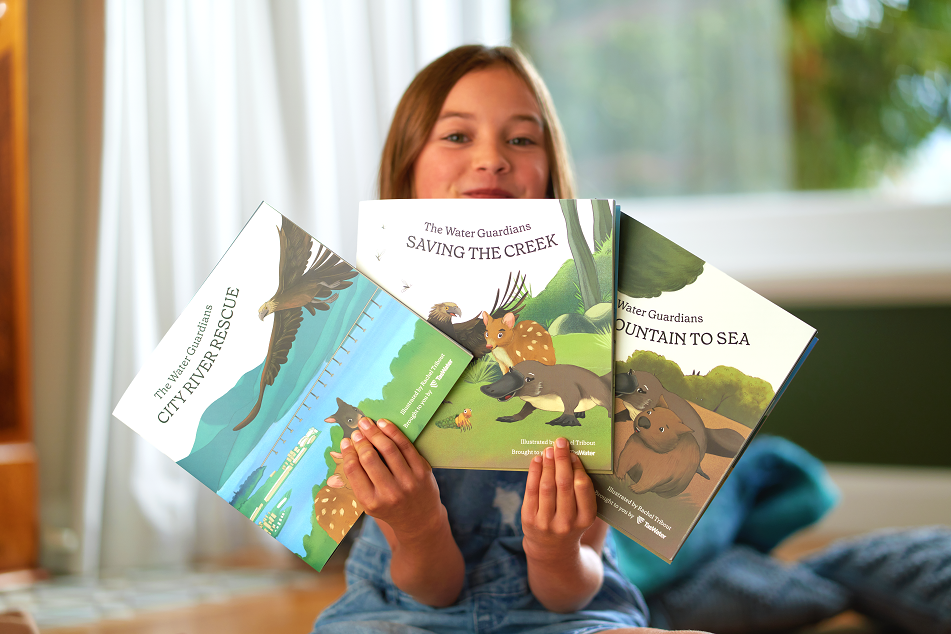
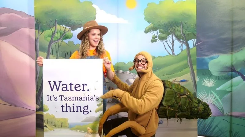
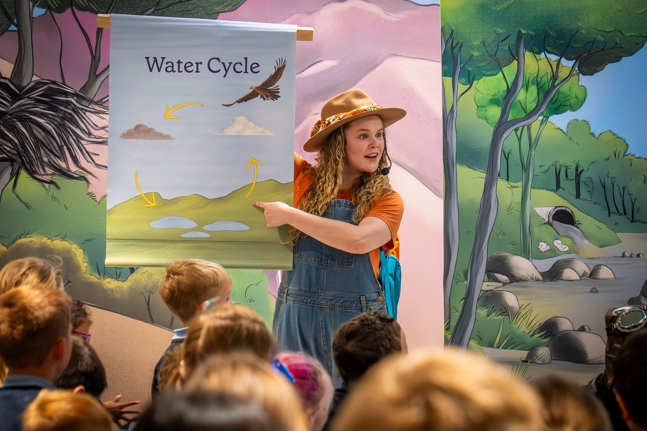
The Water Guardians is TasWater's water literacy program for Tasmanian primary schools, built to help children understand where their water comes from, why it matters, and the role they play in protecting it. It's a curriculum-aligned program developed with education consultant Kimberlin Education, and it reaches students across three formats: a set of illustrated storybooks, a resource-rich website with activities and lesson plans segmented by year level, and a live-streamed theatrical show, The Great Water Rescue, delivered to classrooms across the state with on-demand recordings.
A program this broad needed a single, cohesive visual world: a cast of characters and a set of environments strong enough to carry the storytelling in print, on screen, and in animation. I was engaged to illustrate that world.
character design & animation
The Water Guardians
Client
TasWater (in collaboration with Kimberlin Education)
Project
The Water Guardians
Role
Illustrator, character designer
Category
Illustration / Character design / Animation
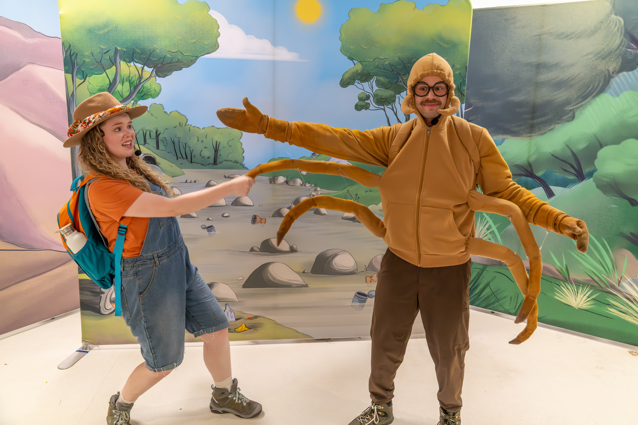
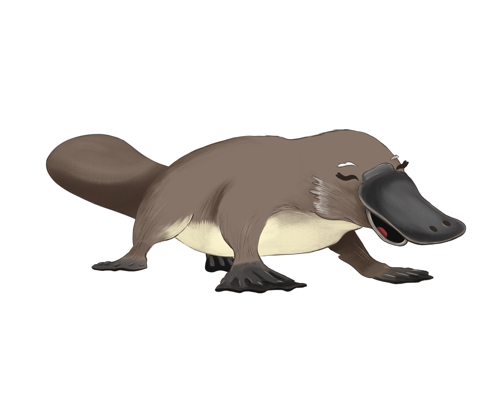
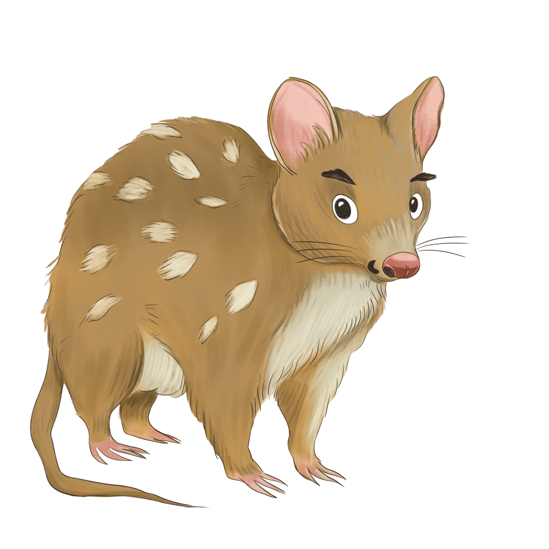
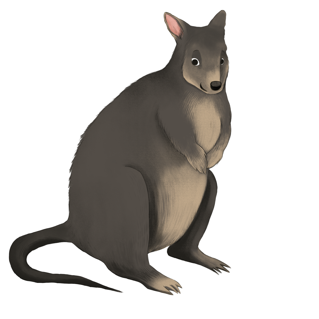
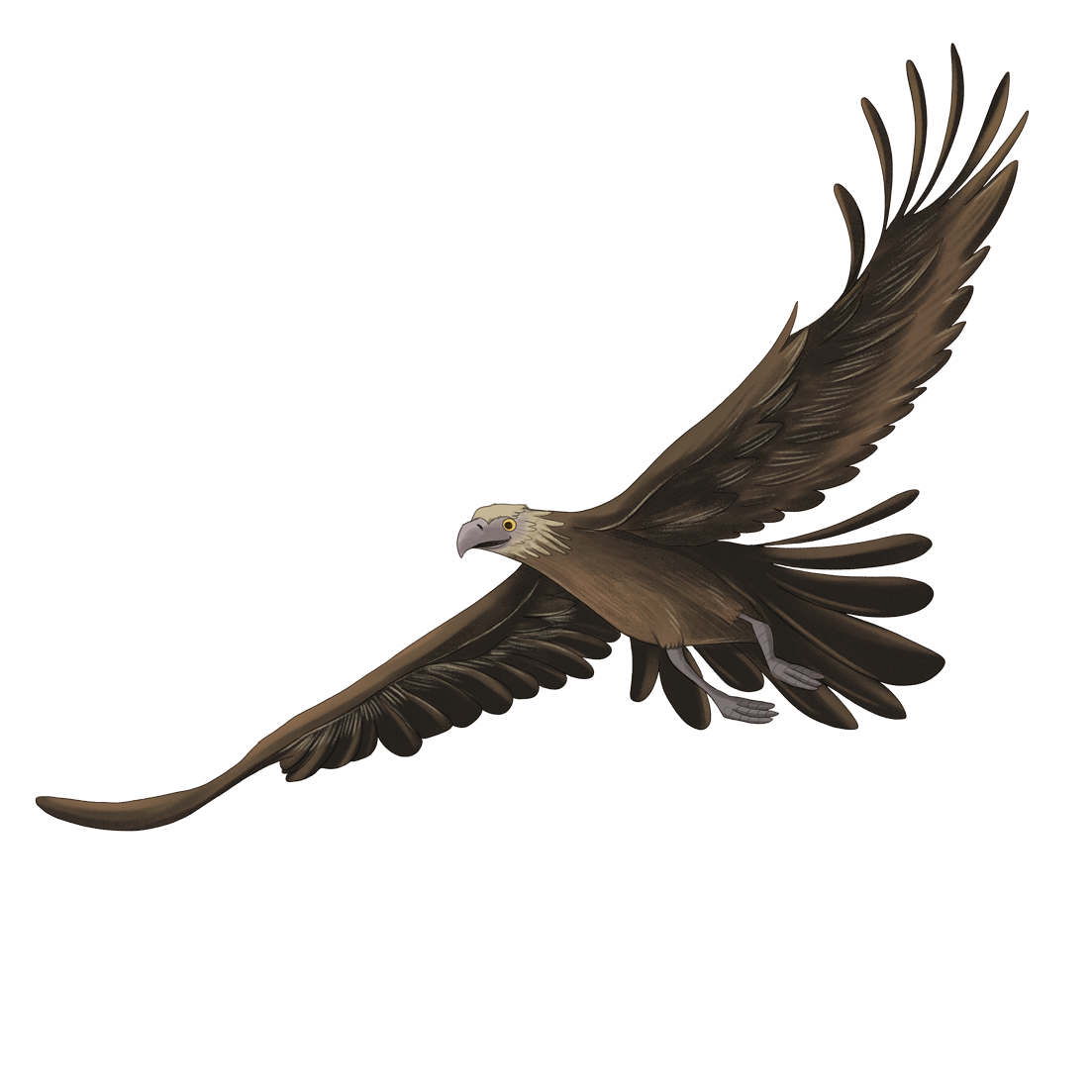
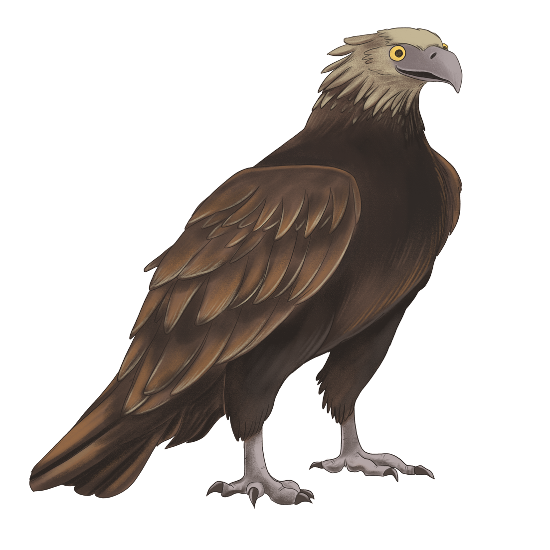
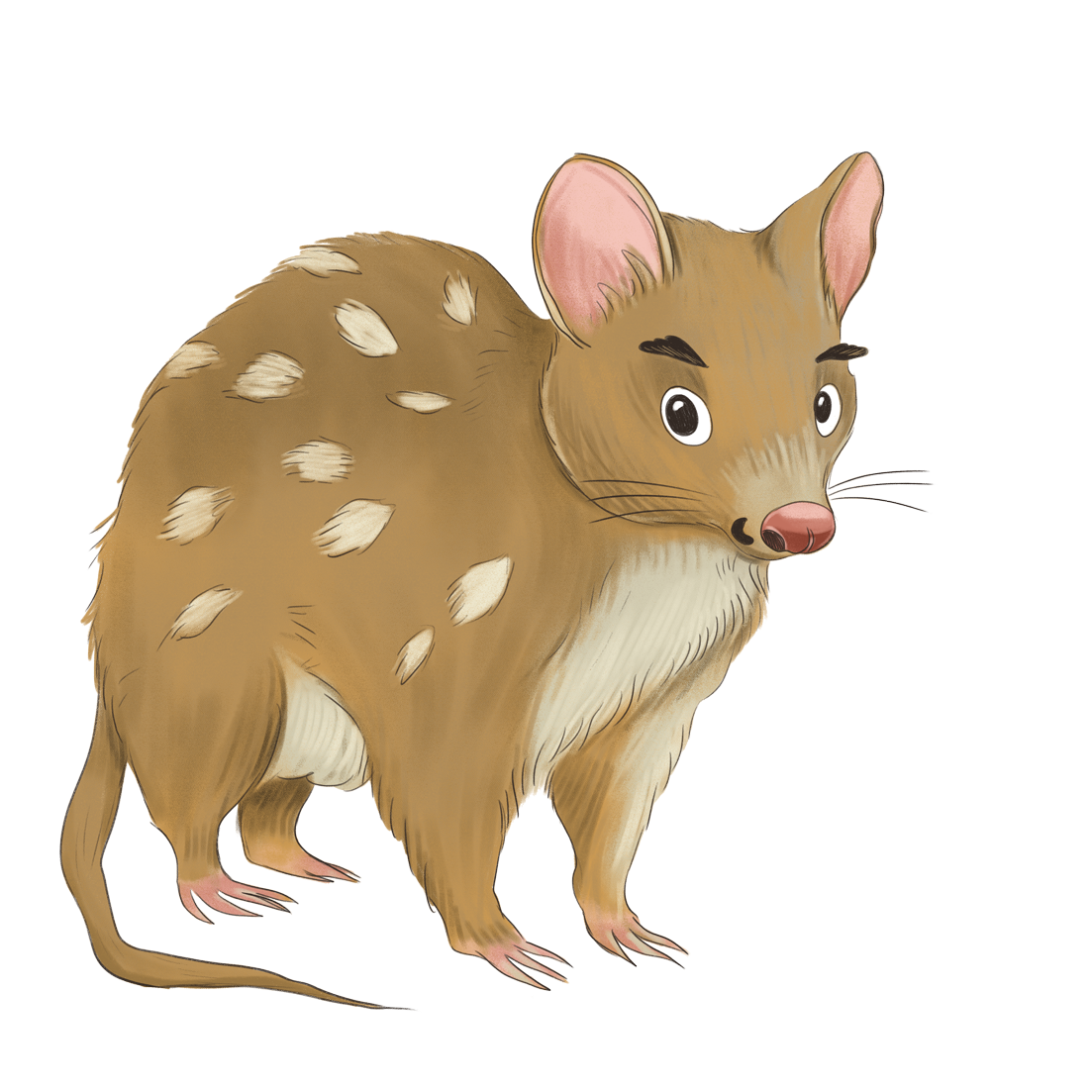
At the centre of the program is a cast of native Tasmanian animals, each built around a real species and given its own personality: Winnie the wombat, Laurel the platypus, Jasper the eastern quoll, Dan the caddisfly larva, Flynn the wedge-tailed eagle, and Paddy the pademelon. Kate Beard at TasWater had already thought deeply about who these characters were, so they arrived feeling real.
My job was to bring them to life visually, and to sit somewhere playful without tipping into babyish, so the stories worked for kids and grown-ups alike.
The Solution
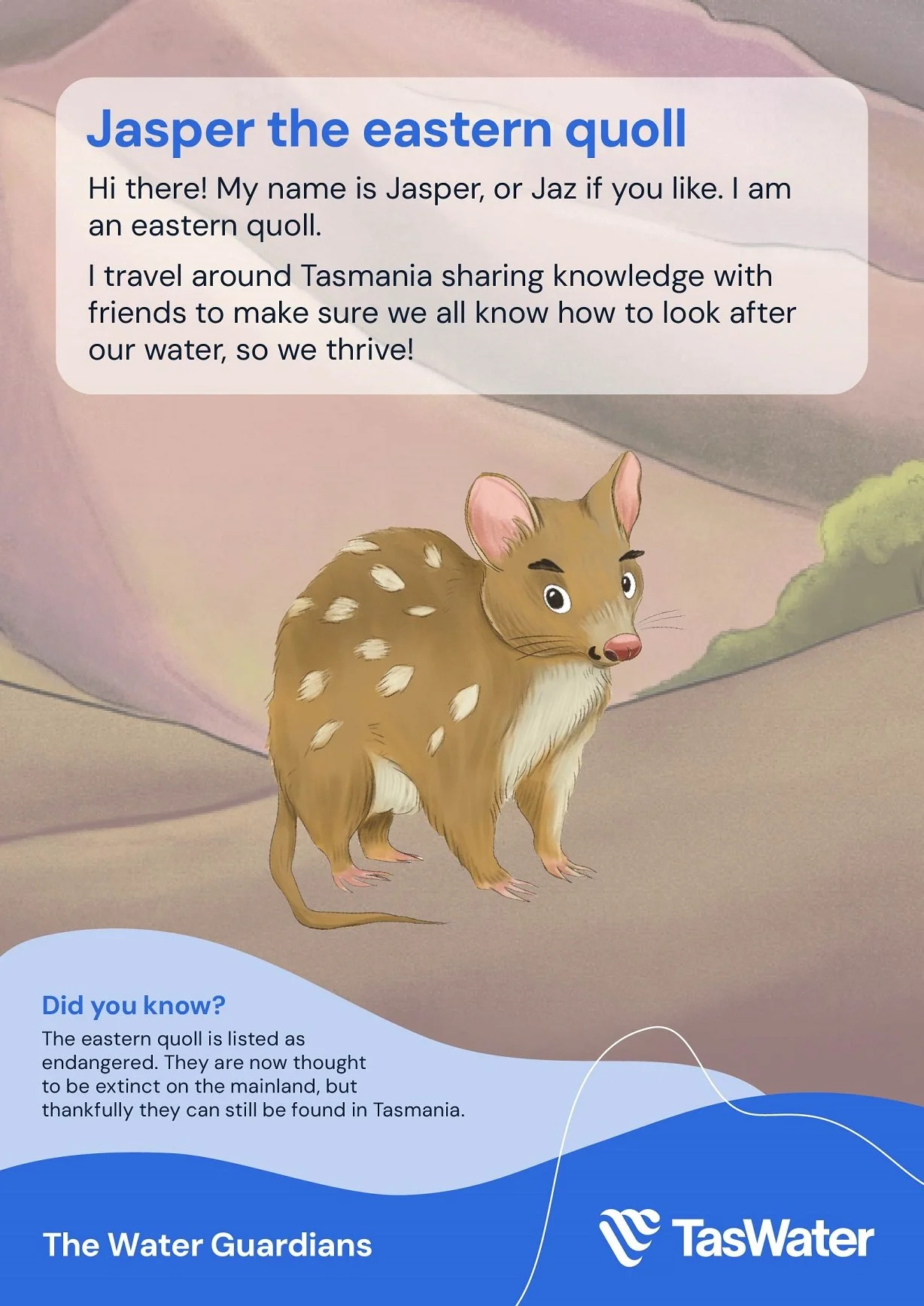
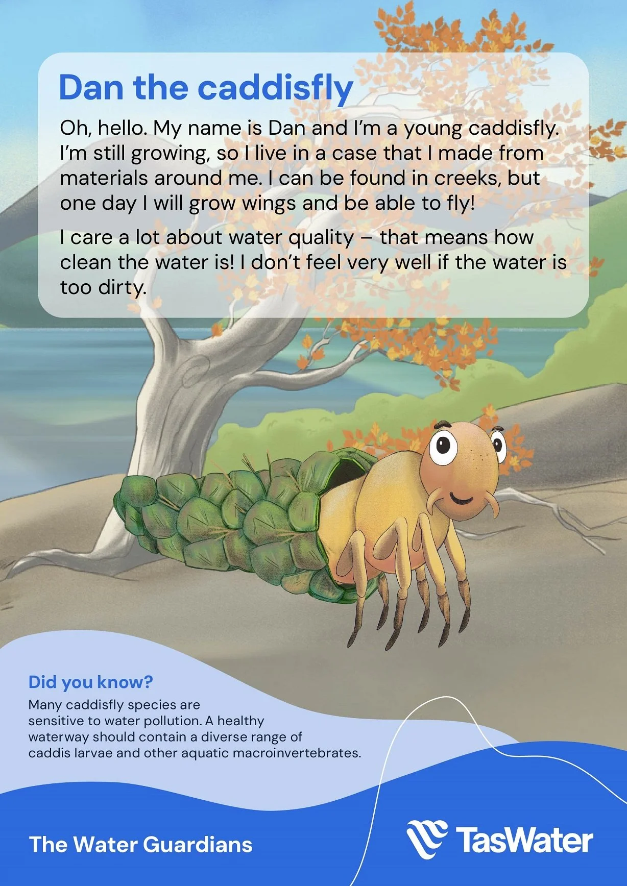
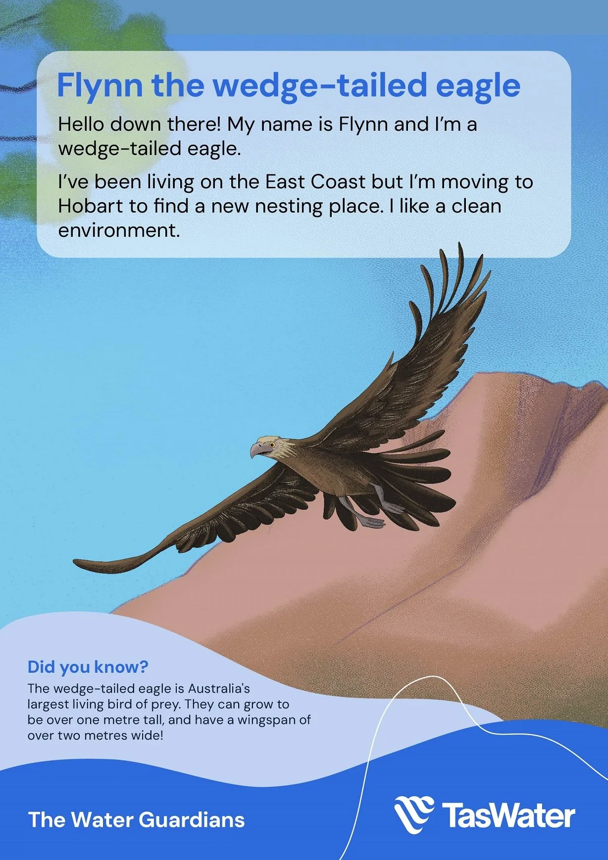
Because the characters were going to be animated, I worked digitally and built them for movement from the start. Each one was drawn with multiple mouths and moving limbs, a bit like a digital paper-doll kit, so they could be posed and animated into any situation the story called for.
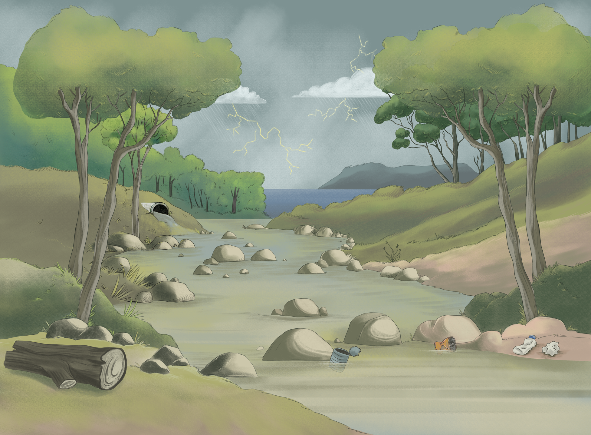
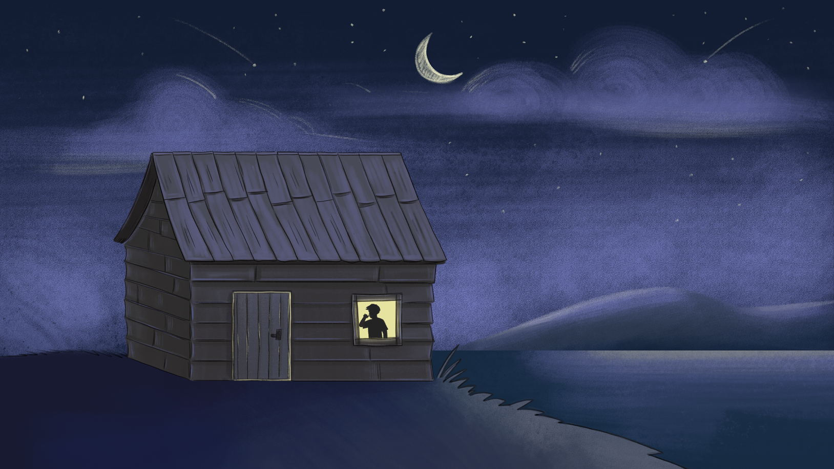
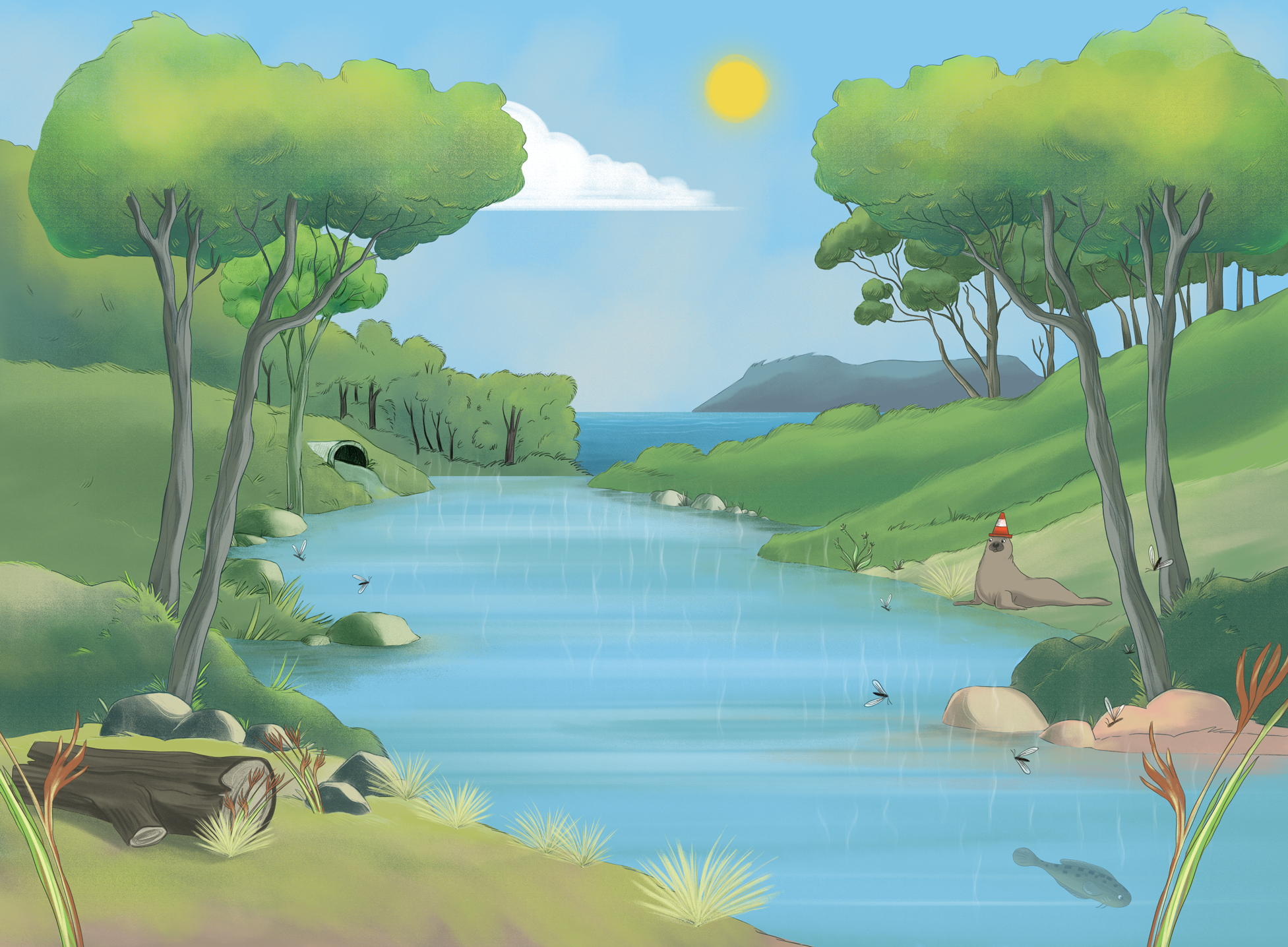
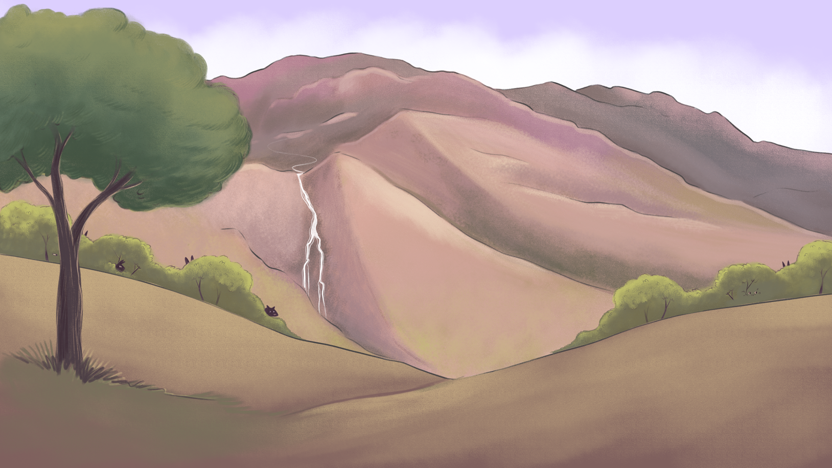
For the settings, I illustrated a series of Tasmanian environments and focused on giving each a true sense of place, not just the landmarks, but the light and mood of the location. Tasmania is diverse and atmospheric, and I wanted every scene to feel like somewhere real.
I built the backgrounds as fully separated layers so Kimberlin Education, who produced the resources, could adapt and reuse the artwork across formats. Their creative manager, Tania, took that further than I imagined, repurposing the background elements not just for animation but to build the books themselves, shuffling and reassembling pieces in ways that pulled even more out of the artwork.
My Contribution
I led the illustration and character design across the whole program: interpreting and designing the full cast, illustrating the story world, and producing the animation-ready character and background files that the rest of the program was built on.
It's a project that drew on many part of my practice, character design, narrative illustration, and the technical craft of preparing artwork for animation and reuse, and it delivered a single, consistent visual world that carried from the printed page to the live-streamed show.