Why I don't have a signature style (and why that's deliberate)
Browse enough illustration portfolios and you'll notice a pattern. Most illustrators have a look, a recognisable visual fingerprint that follows them from project to project. You know their work the moment you see it. It's a legitimate and brilliant strategy, and I genuinely admire illustrators who've built a strong, consistent voice and made it theirs.
I just don't work that way.
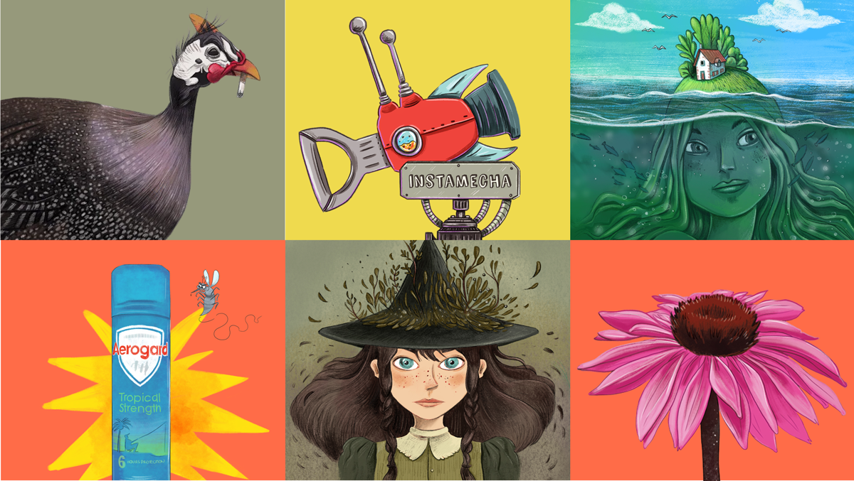
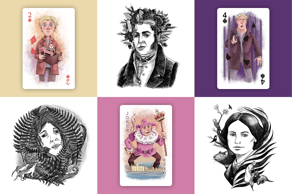
My portfolio looks, at first glance, like it might belong to several different people. A deck of playing cards rooted in Port Arthur's convict history sits alongside a gentle underwater counting book for toddlers. Brand illustrations for a luxury hotel live next to a scientifically accurate picture book about a critically endangered handfish. Historical narrative work done under a creative director shares space with live illustration performed in theatres across China, Japan and the USA.
Same hand. Very different worlds.
This wasn't an accident
I trained as an illustrator, then branched into graphic design, and that second training shaped how I approach every brief. Design is inherently audience-first. You're solving a visual problem for a specific person in a specific context. That thinking never left me.
When I take on a project, the first question I ask isn't what do I want to make? It's what does this project actually need?
That means a discovery session to understand the client's vision, their audience, their brand, and what gap exists in their visual space. It means developing at least two distinct directions, so the conversation is genuinely exploratory rather than a yes or no. The Port Arthur playing cards called for something warm and contemporary that could speak to a child and an adult equally. Macq01 called for something more traditional, where the storytelling lived in the details and the quirkiness of the illustration mashup. Same illustrator, completely different approach, both right for their context.
What stays the same
Even when the style shifts completely, something consistent runs through all of it: the quality of observation, a warmth in the atmosphere, attention to the details that make a scene feel inhabited rather than staged, and always the sense that the image is doing real narrative work.
With Hold On: Saving the Spotted Handfish, the author needed scientific accuracy. The challenge was making rigour feel warm for a young audience. With One Remarkable Reef I had much more freedom and drew something soft and dreamy for children reading before sleep. With Terrapin Puppet Theatre, touring You and Me and the Space Between live across three countries, the style emerged entirely from the constraints of the tool: thick outlines, flat colour, drawn in real time to music and puppetry. Constraint as creative direction.
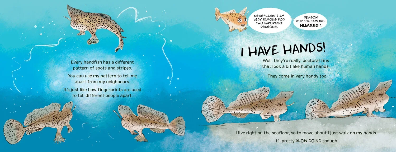
Double page spread from Hold On: Saving the Spotted Handfish

Illustration for One Remarkable Reef
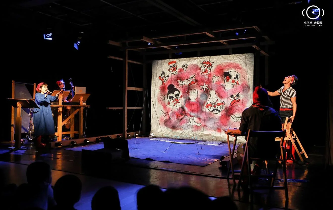
On stage during a performance of You and Me and the Space Between
Making work for no one in particular
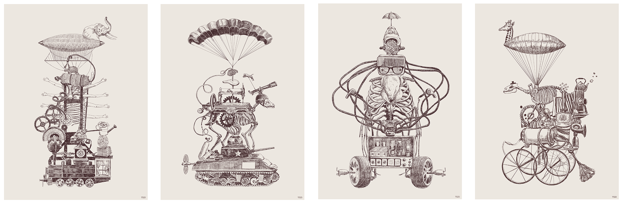
Not everything starts with a brief. Captain Blueberry began as a personal project. I still carve out time for watercolour and ink explorations that don't belong to anyone. This is where the question flips: instead of asking what does this project need, I get to ask what do I want to say. It fills a creative need commissioned work can't always reach, and it quietly feeds back into everything else.
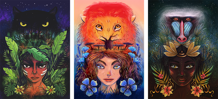
Series of whimsical portrait, created for an local art exhibition in Hobart
Series of illustration created for myself, for fun.
On the pressure to "find your style"
I want to be clear: finding a signature style and committing to it is a completely valid and often smart career move. Most illustrators do it, many thrive because of it. The recognisability builds a reputation, attracts an agent, creates a steady client base that knows exactly what they're getting. I respect that path deeply.
My path just started differently. Working in Tasmania's small creative market early in my career, I quickly realised that if every client got the same visual language, the work would blur together. I needed range. That need, combined with my design training, pushed me toward developing distinct approaches rather than a single one.
If you're a younger illustrator feeling the pressure to lock something in: experiment freely, and follow what feels alive and brings you joy. A signature voice often arrives on its own if you give it room. But if you find yourself genuinely drawn to different worlds and different ways of making, that's not always a lack of direction. It's a different kind of skill. Just make sure your portfolio makes it legible, not a confusing pile of everything, but a clear signal of what you can do and when.
I was always told to find a voice and stick to it. I did the opposite. I approached illustration the way a graphic designer would, working for the brief and the audience rather than for a look. It's served me well. I get to experiment, explore, work across a large array of industries and learn about them and the world in the process. It's opened more doors than it's closed.
And I'll never get bored.